The existing web app for signage content management was designed for enterprise-level operations, making it cumbersome for small businesses. The process for updating content required multiple steps and deep navigation through an unintuitive interface.
To understand these struggles better, we asked 17 of our clients to record themselves performing three essential tasks:
The results were concerning:
It was less of a workflow and more of a 'will-it-work' flow.
When the support team needs support... you know it’s bad.
These challenges underscored the need for a simpler, offline-first approach tailored to the real needs of small business owners.
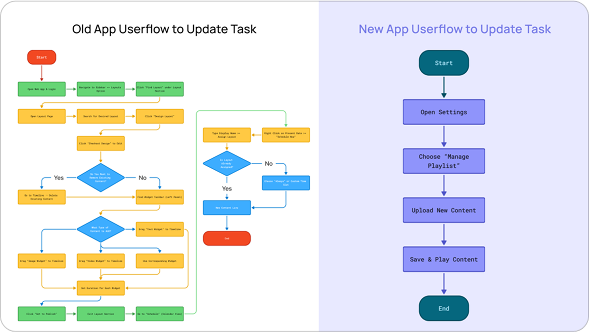
We took a radically simplified approach by eliminating unnecessary complexity. Instead of mirroring enterprise-level features, we built a separate system that allowed any user, regardless of technical skills, to update content within a minute.
Goodbye, scheduling tools. You won’t be missed.
We wanted to remove the friction completely. The goal was:
This meant ruthlessly cutting features that only large franchises needed (like scheduled content). Our target users needed simplicity, not a cockpit of tools.
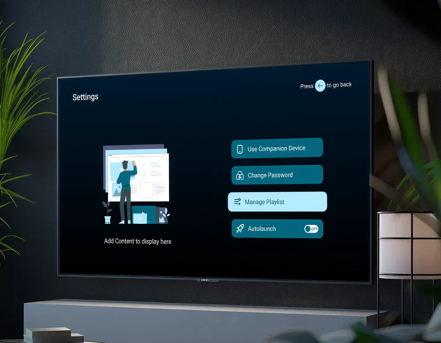
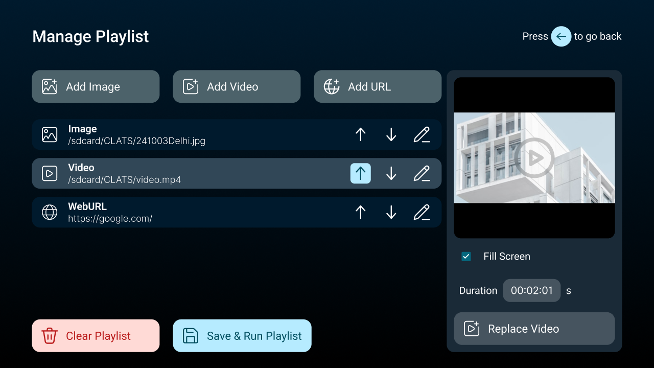
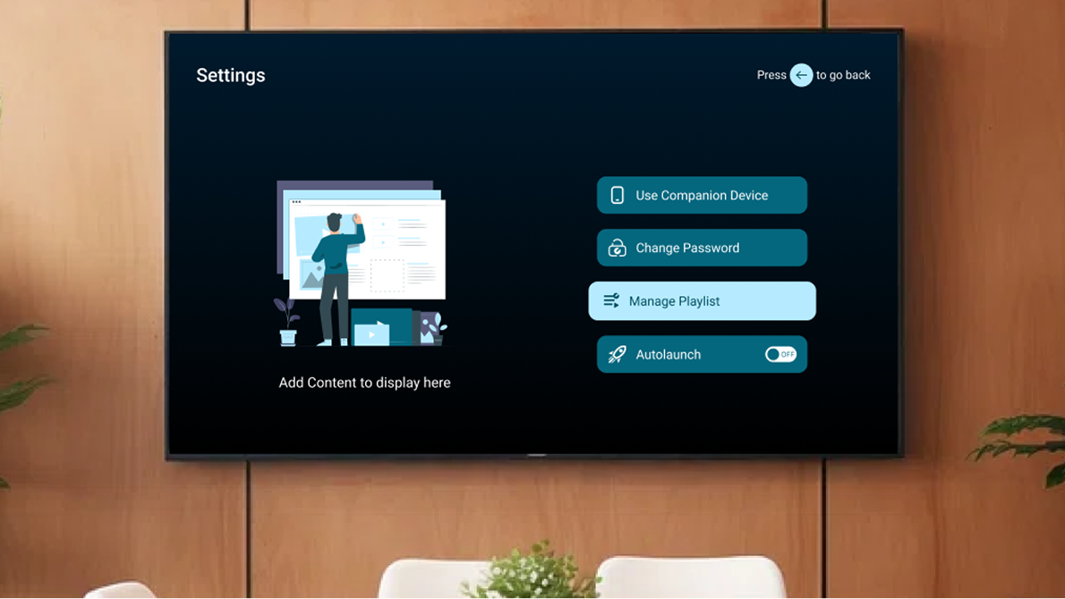
We condensed the entire functionality into two screens:
This change alone removed half the navigation steps of the old system.
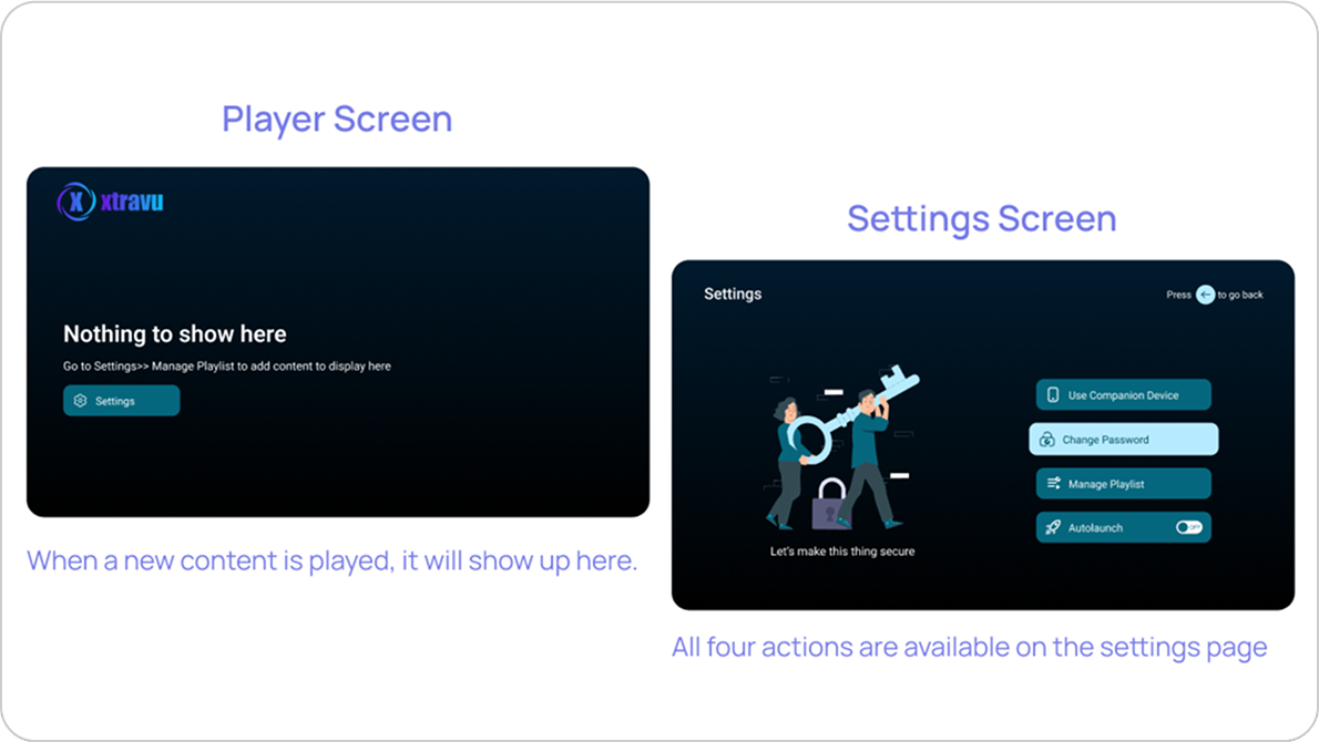
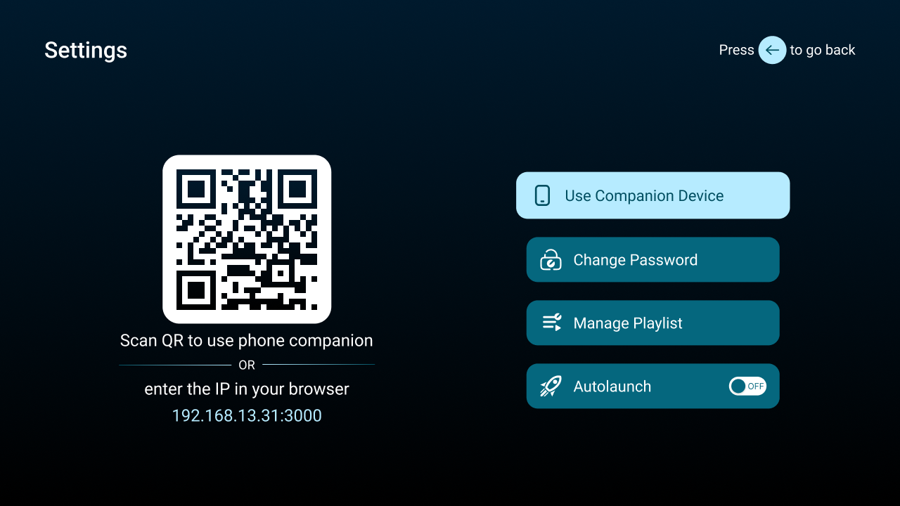
To make the app remote-friendly, we streamlined the UI with just four essential actions:
If it couldn’t be done with four buttons, it didn’t belong.
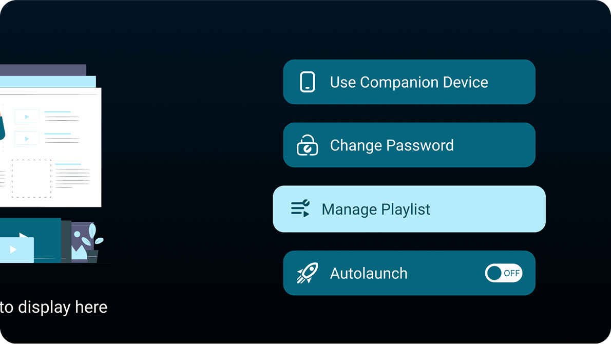
This ensured no training was required—users could instinctively understand what to do.
In other words: no Wi-Fi? No problem.
Using Android TV Material Design principles, we optimized for:
Dark mode, because bright screens and angry clients don’t mix.
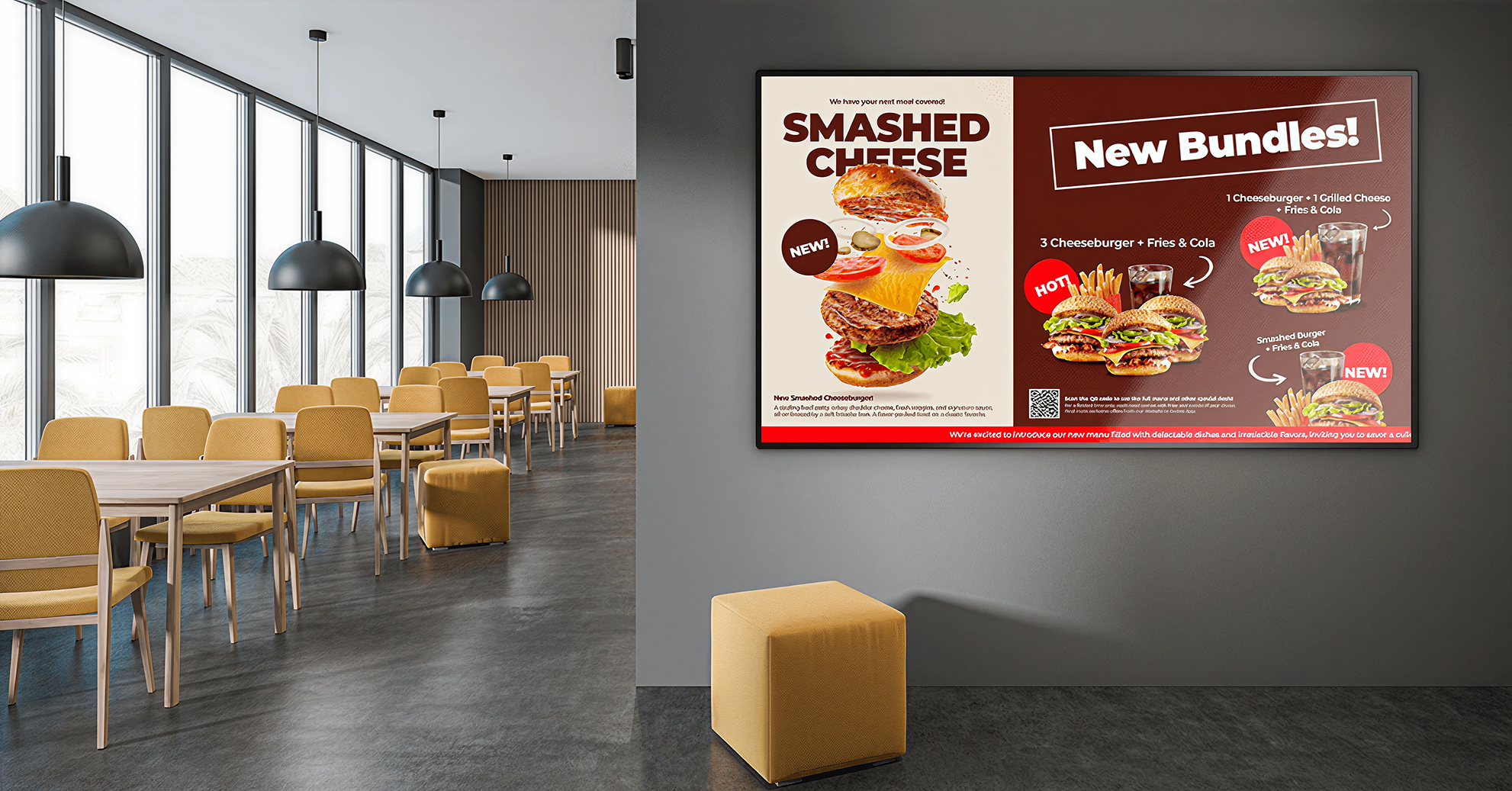
We designed for a resolution of 960x540, which scaled beautifully to 4K screens.
We kept the UI dark-themed with bluish accents and used Poppins, a clean, sans-serif font that felt branded yet readable from a distance.
Dark mode, because bright screens and angry clients don’t mix.
I used Figma for everything:
Did everything in Figma. Adobe XD who?
All components were built using Google’s Material Design library to ensure consistency and remote navigation ease.
Material Design saved my soul and my spacing issues.
We invited support team members (who frequently assisted clients) to perform the three key tasks.
The result: every participant completed the tasks without needing guidance.
Sometimes, no complaints is the feedback.
After refining the design, we sent a prototype to our clients. Every single client was able to complete all tasks.
One client with 13 displays in a showroom raised an important concern: updating content for each display separately was tedious.
13 TVs and one tired human. Scaling pain is real.
While our initial scope focused on small businesses, we recognized this as an opportunity for future scalability when expanding to larger franchises.
While I didn’t work full-time with developers, I have a background in engineering.
I understood their pain points and held meetings to clarify flows and share prototypes.
One of our devs found updating playlists with a remote extremely tedious during testing, as he needed to update playlist many times in order to test properly.
So we quickly added a mobile companion accessible via QR code and local server.
Developer complaints = goldmine features.
That tiny feature turned into a fan favorite.
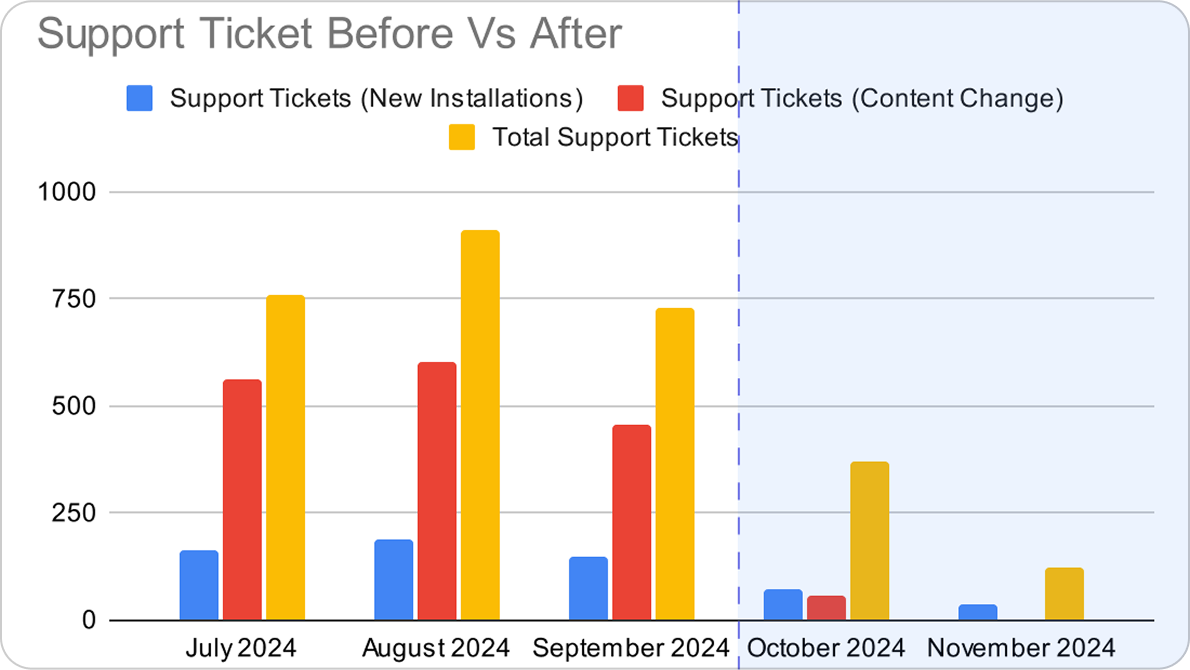
Before launching the app, 13 clients generated 250 support tickets per month, mostly for content updates.
📉 One month after launch:
Support team now has free time to sip chai, and they treated me samosa with it.
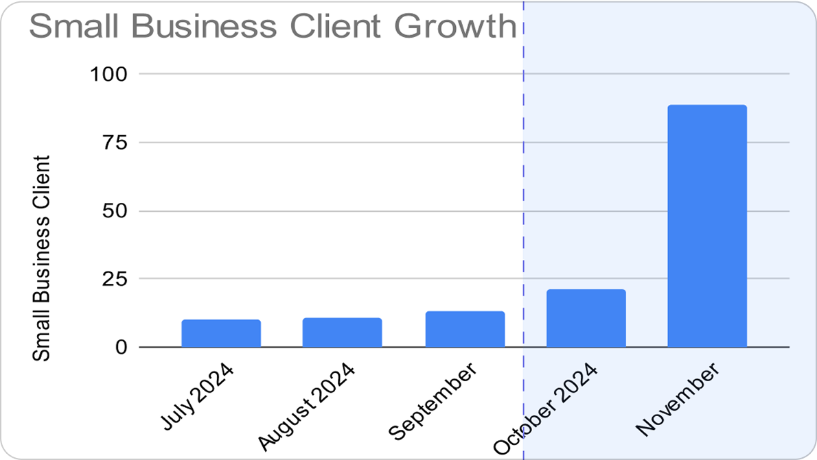
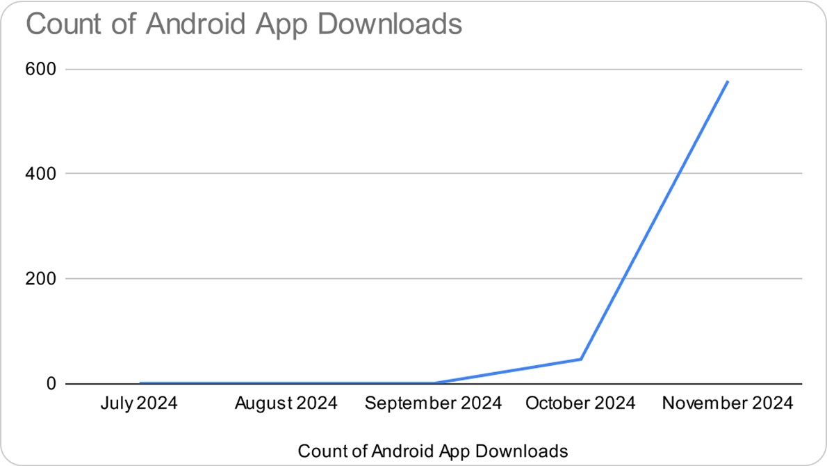
Without any paid marketing, we saw 600+ downloads and grew from 13 to 54 paying clients within months.
Suffering from success.
Clients loved the speed, simplicity, and offline reliability. The rollback feature, in particular, gave them confidence in making updates.
Turns out, simple is surprisingly hard.
✅ Simplified user experience by focusing only on essential features.
✅ Offline-first approach made the app reliable in all conditions.
✅ The mobile companion feature (QR-based access) became an unexpected hit.
✅ Engineering background helped in seamless collaboration with developers.
📌 Start working on mobile companion earlier – It became the preferred interface for younger clients.
Should’ve built that mobile tool sooner. But hey, better late than never.
📌 Plan for larger businesses earlier – While we focused on small businesses, larger businesses wanted a scalable version.
This project reinforced the importance of designing for real-world users rather than just replicating industry standards. By focusing on simplicity, usability, and offline accessibility, we transformed signage management into an effortless task for small businesses.
This success validated our user-centered approach, proving that sometimes, less is more.
Design for people, not personas.